Synopsis
1956 – France. A priest is murdered. An evil is spreading. The sequel to the worldwide smash hit follows Sister Irene as she once again comes face-to-face with Valak, the demon nun.
With over 70 meticulously crafted shots, our Paris and Bangalore teams had the weighty task of making you shiver with THE newsstand scene and immersing you in digital landscapes of the beautiful South of France.
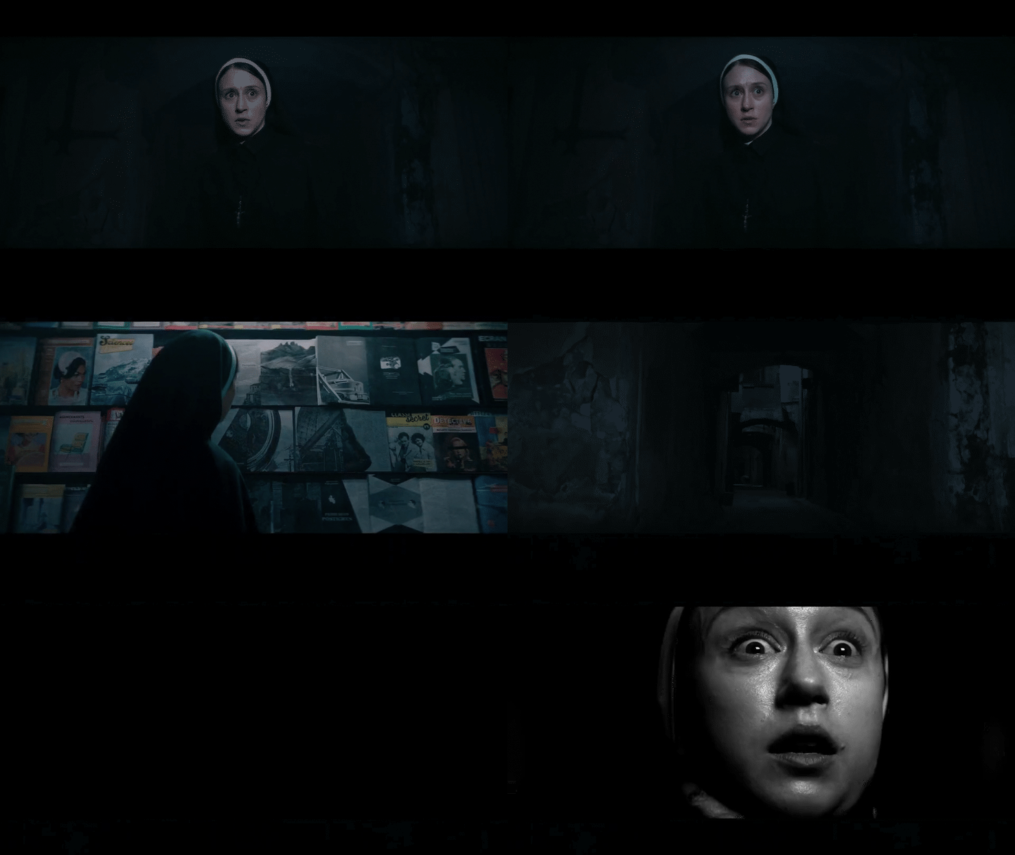
The work of the MPC teams on the newspaper kiosk scene began in pre-production with exchanges of artistic references, then focused on their visual implementation. Laurent Creusot, MPC’s visual effects supervisor, tells us that, « for this film, the references naturally turned towards imagery from the 1950s, with the naivety of the advertisements of that time and highly intense religious images. »
« From the beginning, Michael Chaves had a clear idea of a visual choreography creating tension and suspense, » recalls Bastien Brenot, the CG supervisor. « The Nun would take shape in the form of moving photographs and magazine images. As the pages turned, they would combine to form new faces, and Valak would confront Irene for a final showdown. »
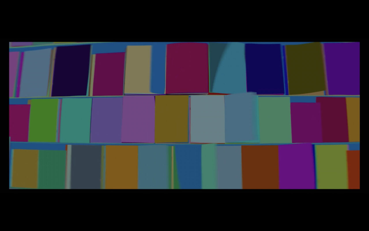
« This sequence required close collaboration between departments at MPC, with technical complexity at every level, » explains Laurent. The design of the assembly of faces on the magazine pages, the movement rhythm, and the evolution of these designs were managed by the motion design department. The result was a flattened view of the entire kiosk, with each magazine animated over the total duration of the sequence. « We had to recreate 83 magazines in 3D to have sufficient control to make artistic decisions at the level of a single page, sometimes even just one side of the page, » Bastien emphasizes.

« The biggest challenge was setting up a pipeline between different software and visual effects departments, » confides Michael Moercant, Motion Design Artist. « The motion design department was the first link in the production chain, and every adjustment we made had a significant influence on the subsequent steps. During production, we had to find a solution to limit the amount of calculated imagery without undermining the existing pipeline, and especially not restricting artistic modifications. »
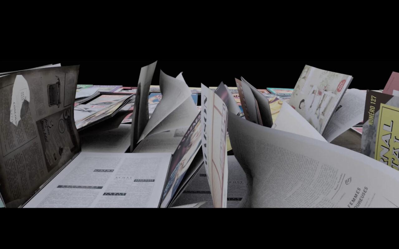
« This scene was important from the start of the project, as it initially required a lot of visual research to get something as close as possible to what the director imagined, » says Agathe Sayegh – Motion Design Artist. « The biggest challenge was primarily in the logistics of production. » There were both the collages of faces, the movement through the kiosk, the emergence of the form of the nun, the rhythm, the number of pages, their movements, etc., but also the collaboration between the motion design department and the 3D department, which worked almost simultaneously with quite long production and rendering times. « Each team had technical constraints, a vision of the result, and had to wait for the other team to produce a sequence to be able to work, and vice versa. It was both a simultaneous hand-in- hand and relayed work, » concludes Agathe. Laurent specifies that « After the motion design department, this sequence went to the FX department, responsible for transforming these static images into pages turning naturally and experiencing the effect of the wind. It was a huge technical challenge. »
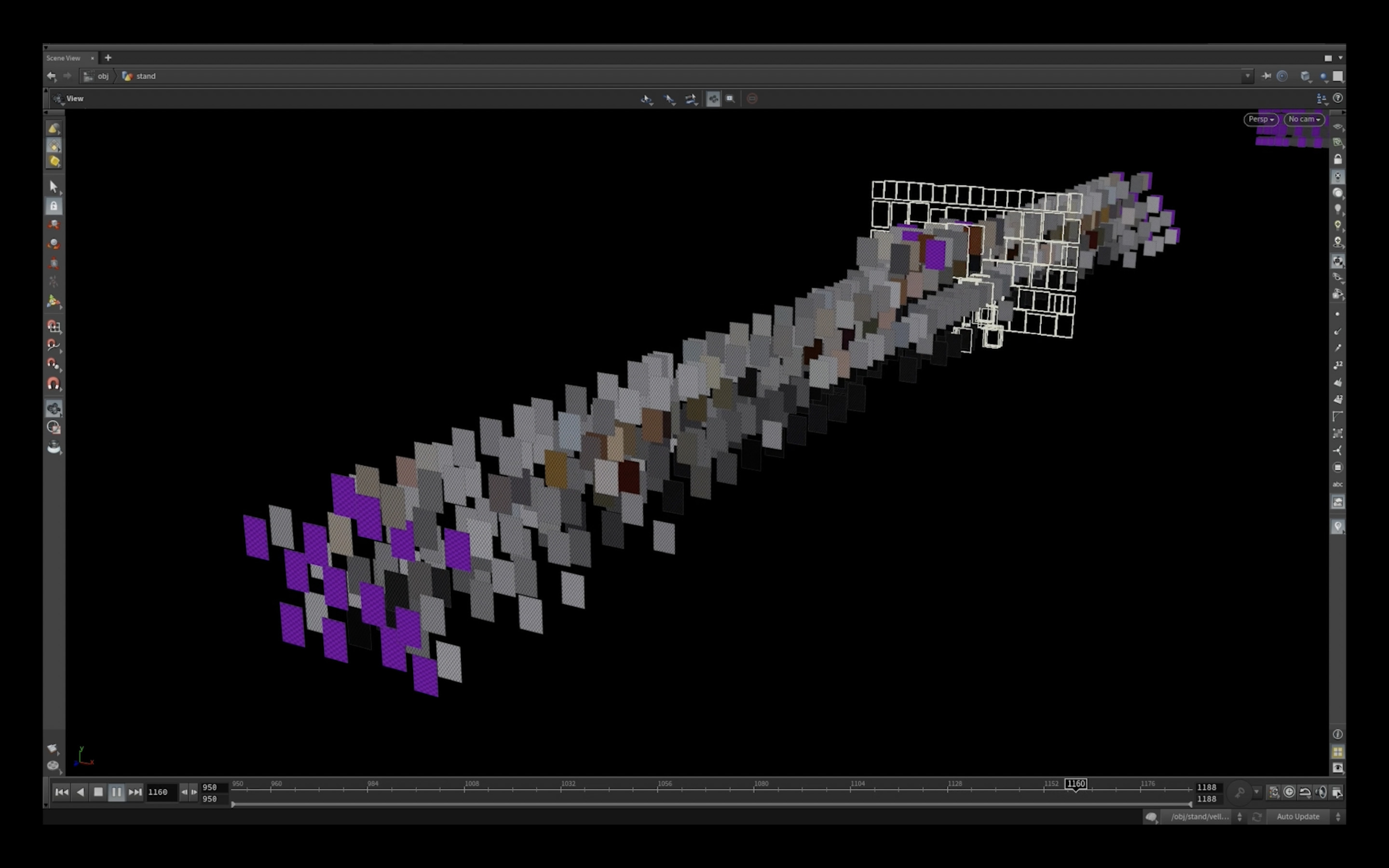
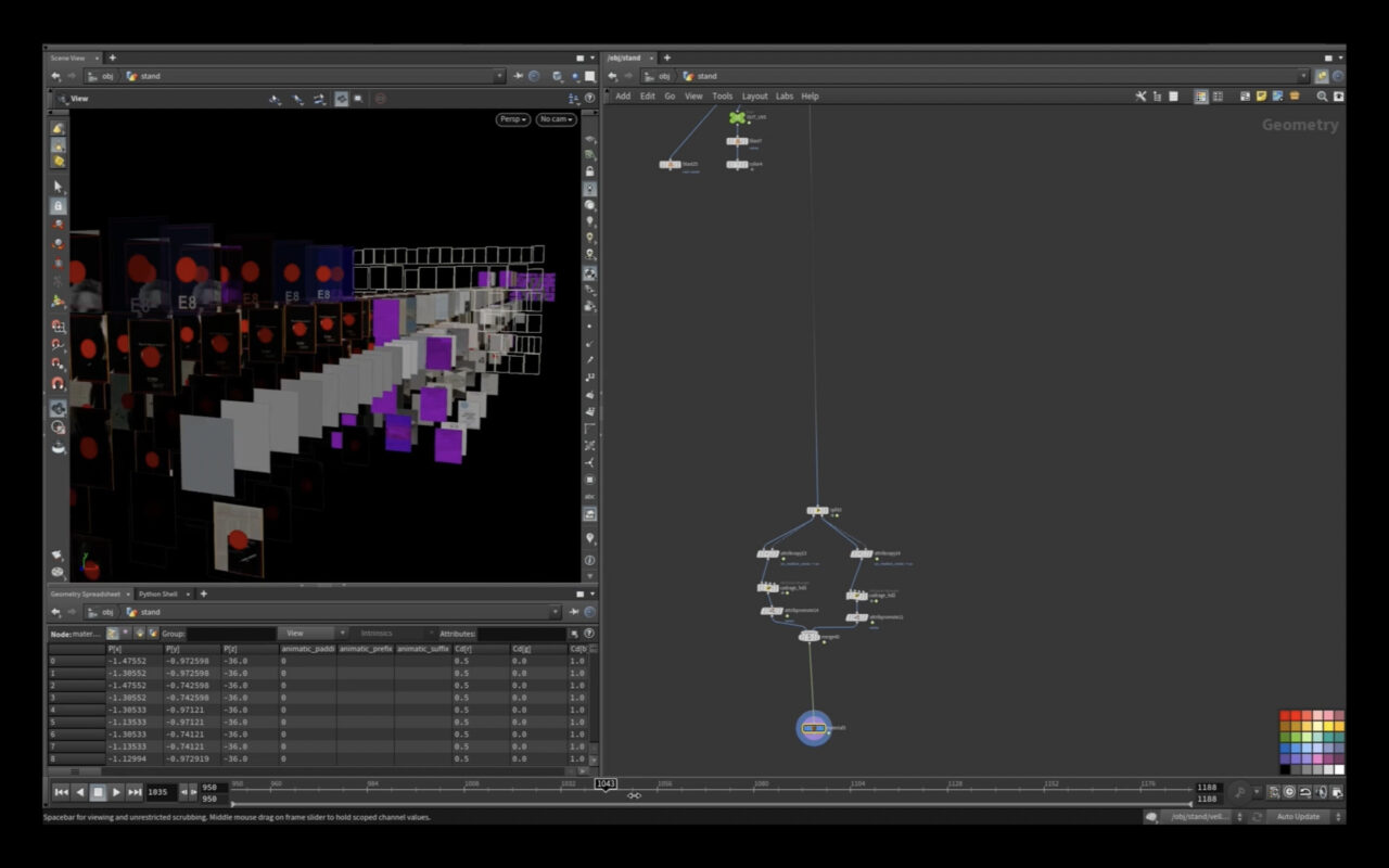
« We quickly opted for a procedural process and set up our first system with Houdini, » Bastien recalls. « We were fortunate to work with a particularly creative Houdini artist, Benjamin Saurine. He came up with the idea of an endless series of pages entering and exiting the magazine simulation. A bit like a barrel organ in a 4D space. Funny anecdote: from the first days of testing, we obtained very good results that were even included in the final version. »
« The FX department then exported data that allowed the lighting department to work on the textures of each page via the 3D software Maya, and then integrate the appropriate light for a realistic render, » Laurent continues, « all while scrupulously following the animation created from the beginning by the motion design department. »
Christophe ‘Tchook’ Courgeau simultaneously took care of the digital set extension of this sequence and specifies that « The sequence was initially shot on a street in Tarascon, France and later replicated in a studio with a blue screen background. We had to extract photogrammetry data from the filming location and clean it up in order to digitally recreate some surfaces that were missing details, such as the window bars for example. » He acknowledges that « living in the country where the film takes place was an advantage for his digital environment and set design team. It was easier to propose sets and atmospheres to the director because these are familiar places for us, and practically, we were able to take photos when needed. »
Bastien Brenot concludes: « The work of the assets, lighting, and compositing teams allowed us to achieve the level of extreme realism we needed for this scene. The recreation of the street, the kiosk, and the magazines was so precise that our entirely 3D-manufactured shots fit seamlessly into the edit with the real shots. »
